The NFL Schedule is a Massive Optimization Problem

This is a fascinating Los Angeles Times piece that profiles the computing power that is required to generate the NFL schedule. A team of four members and hundreds of computers are used to sift through 26,000+ conditions, with trillions of possible permutations, to generate the 2016 NFL schedule:

With 256 games, 17 weeks, six time slots, five networks and four possible game days — Sunday, Monday, Thursday and Saturday — there are hundreds of trillions of potential schedule combinations. Katz and his team are searching for the single best, and they have as many as 255 computers around the world running 24/7 to find the closest possible match to the ideal slate of games.

The schedules that have come out in the last couple of years are much more sophisticated:

Among the scheduling elements that are factored in now, but were not deeply considered in the old days: How much is a team traveling, and how far? Is someone playing a road game against a team coming off its bye week? Is anyone playing a road game six days after being on the road on a Monday night? Is a club overloaded with consecutive opponents who made the playoffs the previous season? Has a team gone multiple seasons with its bye at Week 5 or earlier?

An incredible optimization problem. The ultimate schedule that was selected was hand-judged against 333 other schedules generated by the computers to make sure it was the most optimal schedule.

Read the rest here. Here is the 2016 NFL schedule.

Why Are Americans So Bad at Math?

The New York Times has a noteworthy piece on why math education is so poor in the United States. Borrowing examples from how math is taught in Japan, the article outlines how different initiatives to reform math education in America have failed (and why they are likely to continue to fail). Worth the read.

It wasn’t the first time that Americans had dreamed up a better way to teach math and then failed to implement it. The same pattern played out in the 1960s, when schools gripped by a post-Sputnik inferiority complex unveiled an ambitious “new math,” only to find, a few years later, that nothing actually changed. In fact, efforts to introduce a better way of teaching math stretch back to the 1800s. The story is the same every time: a big, excited push, followed by mass confusion and then a return to conventional practices.

The new math of the ‘60s, the new new math of the ‘80s and today’s Common Core math all stem from the idea that the traditional way of teaching math simply does not work. As a nation, we suffer from an ailment that John Allen Paulos, a Temple University math professor and an author, calls innumeracy — the mathematical equivalent of not being able to read. On national tests, nearly two-thirds of fourth graders and eighth graders are not proficient in math. More than half of fourth graders taking the 2013 National Assessment of Educational Progress could not accurately read the temperature on a neatly drawn thermometer.

I hadn’t heard of this parable/story before, but it is quite the embarrassment:

One of the most vivid arithmetic failings displayed by Americans occurred in the early 1980s, when the A&W restaurant chain released a new hamburger to rival the McDonald’s Quarter Pounder. With a third-pound of beef, the A&W burger had more meat than the Quarter Pounder; in taste tests, customers preferred A&W’s burger. And it was less expensive. A lavish A&W television and radio marketing campaign cited these benefits. Yet instead of leaping at the great value, customers snubbed it.

Only when the company held customer focus groups did it become clear why. The Third Pounder presented the American public with a test in fractions. And we failed. Misunderstanding the value of one-third, customers believed they were being overcharged. Why, they asked the researchers, should they pay the same amount for a third of a pound of meat as they did for a quarter-pound of meat at McDonald’s. The “4” in “¼,” larger than the “3” in “⅓,” led them astray.

Maybe we need to develop more system-wide efforts to showcase teaching styles to observers, like they do in Japan:

In Japan, teachers had always depended on jugyokenkyu, which translates literally as “lesson study,” a set of practices that Japanese teachers use to hone their craft. A teacher first plans lessons, then teaches in front of an audience of students and other teachers along with at least one university observer. Then the observers talk with the teacher about what has just taken place. Each public lesson poses a hypothesis, a new idea about how to help children learn. And each discussion offers a chance to determine whether it worked. Without jugyokenkyu, it was no wonder the American teachers’ work fell short of the model set by their best thinkers.

What else matters? That teachers embrace new teaching styles, and persevere:

Most policies aimed at improving teaching conceive of the job not as a craft that needs to be taught but as a natural-born talent that teachers either decide to muster or don’t possess. Instead of acknowledging that changes like the new math are something teachers must learn over time, we mandate them as “standards” that teachers are expected to simply “adopt.” We shouldn’t be surprised, then, that their students don’t improve.

Here, too, the Japanese experience is telling. The teachers I met in Tokyo had changed not just their ideas about math; they also changed their whole conception of what it means to be a teacher. “The term ‘teaching’ came to mean something totally different to me,” a teacher named Hideto Hirayama told me through a translator. It was more sophisticated, more challenging — and more rewarding. “The moment that a child changes, the moment that he understands something, is amazing, and this transition happens right before your eyes,” he said. “It seems like my heart stops every day.”

Worth reading in entirety here.

The Human Element in Quantification

I enjoyed Felix Salmon’s piece in Wired titled “Why Quants Don’t Know Everything.” The premise of the piece is that while what quants do is important, the human element cannot be ignored.

The reason the quants win is that they’re almost always right—at least at first. They find numerical patterns or invent ingenious algorithms that increase profits or solve problems in ways that no amount of subjective experience can match. But what happens after the quants win is not always the data-driven paradise that they and their boosters expected. The more a field is run by a system, the more that system creates incentives for everyone (employees, customers, competitors) to change their behavior in perverse ways—providing more of whatever the system is designed to measure and produce, whether that actually creates any value or not. It’s a problem that can’t be solved until the quants learn a little bit from the old-fashioned ways of thinking they’ve displaced.

Felix discusses the four stages in the rise of the quants: 1) pre-disruption, 2) disruption, 3) overshoot, and 4) synthesis, described below:

It’s increasingly clear that for smart organizations, living by numbers alone simply won’t work. That’s why they arrive at stage four: synthesis—the practice of marrying quantitative insights with old-fashioned subjective experience. Nate Silver himself has written thoughtfully about examples of this in his book, The Signal and the Noise. He cites baseball, which in the post-Moneyball era adopted a “fusion approach” that leans on both statistics and scouting. Silver credits it with delivering the Boston Red Sox’s first World Series title in 86 years. Or consider weather forecasting: The National Weather Service employs meteorologists who, understanding the dynamics of weather systems, can improve forecasts by as much as 25 percent compared with computers alone. A similar synthesis holds in eco­nomic forecasting: Adding human judgment to statistical methods makes results roughly 15 percent more accurate. And it’s even true in chess: While the best computers can now easily beat the best humans, they can in turn be beaten by humans aided by computers.

Very interesting throughout, and highly recommended.

Statistical Stylometry: Quantifying Elements of Writing Style that Differentiate Successful Fiction

Can good writing be differentiated from bad writing through some kind of algorithm? Many have tried to answer this research question. The latest news in this realm comes from Stony Brook University, in which a group of researchers:

…[T]ook 1000 sentences from the beginning of each book. They performed systematic analyses based on lexical and syntactic features that have been proven effective in Natural Language Processing (NLP) tasks such as authorship attribution, genre detection, gender identification, and native language detection.

“To the best of our knowledge, our work is the first that provides quantitative insights into the connection between the writing style and the success of literary works,” Choi says. “Previous work has attempted to gain insights into the ‘secret recipe’ of successful books. But most of these studies were qualitative, based on a dozen books, and focused primarily on high-level content—the personalities of protagonists and antagonists and the plots. Our work examines a considerably larger collection—800 books—over multiple genres, providing insights into lexical, syntactic, and discourse patterns that characterize the writing styles commonly shared among the successful literature.”

I had no idea there was a name for this kind of research. Statistical stylometry is the statistical analysis of variations in literary style between one writer or genre and another. This study reports, for the first time, that the discipline can be effective in distinguishing highly successful literature from its less successful counterpart, achieving accuracy rates as high as 84%.

The best book on writing that I’ve read is Stephen King’s On Writing, in which he echoes the descriptive nature of writing that the researchers back up as well:

[T]he less successful books also rely on verbs that explicitly describe actions and emotions (“wanted”, “took”, “promised”, “cried”, “cheered”), while more successful books favor verbs that describe thought-processing (“recognized”, “remembered”) and verbs that simply serve the purpose of quotes (“say”).

Tuesday’s Logic Puzzles

A brief break from reading this afternoon to tackle two logic/math problems below. See if you can deduce the answer on your own. Leave a comment if you know the answer!

1) Consider an analog clock with both an hour hand and a minute hand. What is the first time after 6PM that the hour hand and the minute hand are exactly coincident (i.e., on top of one another)? NOTEYour answer should be in this format: HH:MM:SS.DDD, where HH = hour, MM = minutes, SS = seconds, and DDD is the 1/1000th of a second decimal equivalent. (HINT: the first thing that comes to mind, 6:30PM, is an incorrect response).

2) Consider a room  with a very large table on which stand 100 lamps, each with an on/off switch. The lamps are arranged in a straight line, and each one is numbered 1, 2, 3, …, 99, 100. At the beginning of the experiment, all the lamps are turned off.

This room has an entry door and a separate door for an exit. One hundred people are recruited to participate in this experiment. Each of the 100 participants is also numbered 1 to 100, inclusive. When participant number 1 enters the room, he turns on EVERY lamp, and exits. When participant 2 enters the room, he flips the switch for every second lamp (thus, turning off lamps 2, 4, 6, 8, 10, and so on because participant 1 has turned all the lamps on his turn). Participant 2 exits and then participant 3 enters. Participant 3 flips the switch on every third lamp (thus changing the on/off state of the lamps which are numbered 3, 6, 9, 12, and so on). This process continues until all 100 participants have taken their turn and passed through the room.

Assume each participant can properly count and doesn’t make any mistakes in changing the on/off state of the lamp(s) he’s assigned to change the state of. Here is the question: after the 100th participant completes his journey through the room, how many lamps are illuminated? And which of those lamps (i.e., reference by number) are they?

###

UPDATE (1:30PM): Both questions have been answered in the comments. To make up for these relatively simple questions, I’ll post a much more challenging logic question in the evening. It will have to do with a deck of cards.

The Origin of the “Plus” and “Minus” Symbols

A very interesting post by Mario Livio, searching for the origin of the “+” and “-” symbols we find ubiquitous today:

The ancient Greeks expressed addition mostly by juxtaposition, but sporadically used the slash symbol “/” for addition and a semi-elliptical curve for subtraction.  In the famous Egyptian Ahmes papyrus, a pair of legs walking forward marked addition, and walking away subtraction.  The Hindus, like the Greeks, usually had no mark for addition, except that “yu” was used in the Bakhshali manuscript Arithmetic (which probably dates to the third or fourth century).  Towards the end of the fifteenth century, the French mathematician Chuquet (in 1484) and the Italian Pacioli (in 1494) used “\boldmath{\bar{\bf p}}” or “p” (indicating plus) for addition and “\boldmath{\widetilde{\bf m}}” or “m” (indicating minus) for subtraction.

There is little doubt that our + sign has its roots in one of the forms of the word “et,” meaning “and” in Latin.  The first person who may have used the + sign as an abbreviation for et was the astronomer Nicole d’Oresme (author of The Book of the Sky and the World) at the middle of the fourteenth century.  A manuscript from 1417 also has the + symbol (although the downward stroke is not quite vertical) as a descendent of one of the forms of et.

I thought this was an interesting sidenote for “+”:

As a historical curiosity, I should note that even once adopted, not everybody used precisely the same symbol for +.  Widman himself introduced it as a Greek cross + (the sign we use today), with the horizontal stroke sometimes a bit longer than the vertical one.  Mathematicians such as Recorde, Harriot and Descartes used this form.  Others (e.g., Hume, Huygens, and Fermat) used the Latin cross “†,” sometimes placed horizontally, with the crossbar at one end or the other.  Finally, a few (e.g., De Hortega, Halley) used the more ornamental form “\maltese.”

Speaking of crosses, and doing a bit more research, Wikipedia notes that:

A Jewish tradition that dates from at least the 19th century is to write plus using a symbol like an inverted T. This practice was adopted into Israeli schools (this practice goes back to at least the 1940s) and is still commonplace today in elementary schools (including secular schools) but in fewer secondary schools. It is also used occasionally in books by religious authors, but most books for adults use the international symbol “+”. The usual explanation for this practice is that it avoids the writing of a symbol “+” that looks like a Christian cross.

+1 for learning more, right?

Nassim Taleb on Big Data

This is a strange article from Nassim Taleb, in which he cautions us about big data:

[B]ig data means anyone can find fake statistical relationships, since the spurious rises to the surface. This is because in large data sets, large deviations are vastly more attributable to variance (or noise) than to information (or signal). It’s a property of sampling: In real life there is no cherry-picking, but on the researcher’s computer, there is. Large deviations are likely to be bogus.

I had to re-read that sentence a few times. It still doesn’t make sense to me when I think of “big data.” As the sample size increases, large variations due to chance actually decrease. This is a good comment in the article which captures my thoughts:

This article is misleading. When the media/public talk about big data, they almost always mean big N data. Taleb is talking about data where P is “big” (i.e., many many columns but relative few rows, like genetic microarray data where you observe P = millions of genes for about N = 100 people), but he makes it sound like the issues he discuss apply to big N data as well. Big N data has the OPPOSITE properties of big P data—spurious correlations due to random noise are LESS likely with big N. Of course, the more important issue of causation versus correlation is an important problem when analyzing big data, but one that was not discussed in this article.

So I think Nassim Taleb should offer an explanation on what he means by BIG DATA.

Largest Prime Number Discovered

Back when I was in college, I participated in the great GIMPS Project, searching for what is known for a Mersenne prime number (Mersenne primes are of the form (2^X)-1, with the first primes being 3, 7, 31, and 127 corresponding to X = 2, 3, 5, and 7, respectively). My computer would use its extraneous resources to help in the search, and while nothing ever came of it, it’s pretty cool to know that I made a modest contribution to the project. So it was great to learn today that the GIMPS Project found the largest prime number ever as of January 2013. The largest (known) prime number now is 2^57,885,161-1, and its discovery is noted on this post:

The new prime number is a member of a special class of extremely rare prime numbers known as Mersenne primes. It is only the 48th known Mersenne prime ever discovered, each increasingly difficult to find. Mersenne primes were named for the French monk Marin Mersenne, who studied these numbers more than 350 years ago. GIMPS, founded in 1996, has discovered all 14 of the largest known Mersenne primes. Volunteers download a free program to search for these primes with a cash award offered to anyone lucky enough to compute a new prime. Chris Caldwell maintains an authoritative web site on the largest known primes as well as the history of Mersenne primes.

To prove there were no errors in the prime discovery process, the new prime was independently verified using different programs running on different hardware. Serge Batalov ran Ernst Mayer’s MLucas software on a 32-core server in 6 days (resource donated by Novartis[2] IT group) to verify the new prime. Jerry Hallett verified the prime using the CUDALucas software running on a NVidia GPU in 3.6 days. Finally, Dr. Jeff Gilchrist verified the find using the GIMPS software on an Intel i7 CPU in 4.5 days and the CUDALucas program on a NVidia GTX 560 Ti in 7.7 days.

This largest prime number contains 17,425,170 digits. If you have a fast Internet connection, you can see how huge this number is (with all of its digits written out one by one) by clicking here. Pretty cool.

Felix Baumgartner: The Mathematics of Falling Faster than the Speed of Sound

Earlier this month, Felix Baumgartner jumped from 39,045 meters, or 24.26 miles, above the Earth from a capsule lifted by a 334-foot-tall helium filled balloon (twice the height of Nelson’s column and 2.5 times the diameter of the Hindenberg). The jump was equivalent to a fall from 4.4 Mount Everests stacked on top of each other, or falling 93% of the length of a marathon.

At 24.26 miles above the Earth, the atmosphere is very thin and cold, only about -14 degrees Fahrenheit on average. The temperature, unlike air pressure, does not change linearly with altitude at such heights. Jason Martinez, a programmer at Wolfram|Alpha, did a number of calculations to see how Felix’s record-setting jump came to be. It’s a very math-heavy post, but something I have been looking forward to!


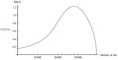
Felix Baumgartner’s mach speed at various portions of his free fall.

If you’re into the nitty-gritty mathematical computations, I suggest reading the whole blog post.

Fractal Kitties: They Exist

Fun post at Scientific American explaining how fractal kitties can explain Julia sets:

Julia sets for polynomials of degree two are well-understood, although they’re often fractals rather than simple shapes such as circles. The story gets a lot more complicated as the degree increases because higher-degree polynomials are difficult to factor. (The much-maligned quadratic formula—the reason why we can easily discern the roots of degree two polynomials—is our friend!) A little bit is known about the possible shapes for Julia sets of degree 3 and 4 polynomials, but the shapes of the Julia sets of arbitrary polynomials are not yet understood.

Lindsey is a graduate student in mathematics at Cornell University. Her advisor is John Smillie, but Thurston was an unofficial second advisor, and it was his idea to start this research project. “I was sitting in his house, and he was staring off into space and asked, ‘I wonder if Julia sets can be made into shapes,’” she says. Thurston had been working on understanding the Mandelbrot set better, and looking at the shapes of Julia sets was a related pursuit. The Mandelbrot set, one of the most famous fractals, is closely related to Julia sets of degree two polynomials: imagine the polynomial z2+c, where c can be any complex number. The number c is in the Mandelbrot set if 0 is in the filled Julia set of z2+c.

Fractal Kitty!

The math may get hairy at times…but then again, so do the images. Ha!