Building the Largest Ship in the World

The Maersk Triple E is the largest ship ever built. Photographer Alastair Philip Wiper was commissioned to photograph how the ship is being built, and shares his experience on his blog:

The Daewoo Shipbuilding and Marine Engineering (DSME) shipyard in South Korea is the second largest shipbuilder in the world and one of the “Big Three” shipyards of South Korea, along with the Hyundai and Samsung shipyards. The shipyard, about an hour from Busan in the south of the country, employs about 46,000 people, and could reasonably be described as the worlds biggest Legoland. Smiling workers cycle around the huge shipyard as massive, abstractly over proportioned chunks of ships are craned around and set into place: the Triple E is just one small part of the output of the shipyard, as around 100 other vessels including oil rigs are in various stages of completion at the any time. The man in charge of delivering the Triple E’s for Maersk is Søren Arnberg, and the Matz Maersk is the last ship he is delivering before his retirement. Søren started his career with Maersk as an engineer in 1976 and has travelled the world since, contributing to the construction of hundreds of ships. Søren is hard-boiled of Dane with a glint in his eye and a dry sense of humor, who is not impressed by much.”It’s just another container vessel, it’s just a bit bigger” he says. “I’ve never been in a project with so much focus. Discovery Channel even made 6 episodes about it. It’s just a ship.” Søren, who is one of the stars of the Discovery Channel series, still hasn’t even watched it. “What are you going to do when you get home?” I ask. “Ask my new boss” he replies, referring to his wife.

Maersk-Triple-E-c-Alastair-Philip-Wiper-110

Click here to see the original story (photo gallery) in Wired.

State of the Photoblog Industry, Photo Friday Edition

I was curious about the state of the photoblog industry recently, and was interested to find out what kind of people still post on an active basis on their blogs. Some of my favorite photobloggers over the years are still publishing (albeit very infrequently), while others have quit photoblogging altogether (yours truly included).

As a fan of data, I went to the Photo Friday website and decided to see how many people are entering the Photo Friday contest these days. I pulled the data into Excel and plotted the number of entries into the contest since the contest’s inception in 2002 to present (September 2014). The plot appears below, with the red line highlighting a 14-week moving average in number of entries to the contest:

Screen Shot 2014-09-22 at 9.41.00 PM


A few observations:

  1. Peak number of entries to the Photo Friday contest occurred between 2004 and 2006, when an average of more than six hundred entries were submitted on a consistent weekly basis.
  2. The number of entries to Photo Friday contest has been on a gradual decline since late 2008, with no rebound in sight.
  3. There has not been a single week in 2014 in which more than 200 entries were submitted to the Photo Friday contest. By contrast, there was not a single week from February 2004 until April 2009 where fewer than 200 entries were submitted to the Photo Friday challenge.
  4. If an extrapolation can be made, the last year in which more than 100 entries would have been submitted to the Photo Friday contest  would be in 2014.

One of my other, biased proxies regarding the state of the photoblogs? When one of the best photoblog out there, Daily Dose of Imagery, decided to call it quits on July 4, 2013—after ten years of daily photoblogging.

James Franco on the Importance of the Selfie

The Oxford English Dictionaries chose “selfie” as its word of the year for 2013. I haven’t been one to post any selfies on my Instagram account and have done very few self-portraits on my (now defunct) photoblog. But when I read James Franco’s op-ed in The New York Times titled “The Meanings of the Selfie,” I mulled over what he had written and started to gather a renewed appreciation for the phenomenon. Franco writes:

But a well-stocked collection of selfies seems to get attention. And attention seems to be the name of the game when it comes to social networking. In this age of too much information at a click of a button, the power to attract viewers amid the sea of things to read and watch is power indeed. It’s what the movie studios want for their products, it’s what professional writers want for their work, it’s what newspapers want — hell, it’s what everyone wants: attention. Attention is power. And if you are someone people are interested in, then the selfie provides something very powerful, from the most privileged perspective possible.

The perspective here is misguided, however. His central premise is that we, as humans, must persistently seek some kind of validation for what we do. For Franco, apparently that comes from getting lots of comments and faves on his Instagram account.

Franco goes on to differentiate between the celebrity selfie and the non-celebrity selfie, and this is where his essay picks up some pace:

Now, while the celebrity selfie is most powerful as a pseudo-personal moment, the noncelebrity selfie is a chance for subjects to glam it up, to show off a special side of themselves — dressing up for a special occasion, or not dressing, which is a kind of preening that says, “There is something important about me that clothes hide, and I don’t want to hide.”

Of course, the self-portrait is an easy target for charges of self-involvement, but, in a visual culture, the selfie quickly and easily shows, not tells, how you’re feeling, where you are, what you’re doing.

But it was the way Franco ended the essay that really captured my attention:

I am actually turned off when I look at an account and don’t see any selfies, because I want to know whom I’m dealing with. In our age of social networking, the selfie is the new way to look someone right in the eye and say, “Hello, this is me.”

I am still not 100% in agreement: there are amazing photographers on Instagram that never post selfies. But I would agree that given someone who has a similar following on Instagram, the person who is more revealing, the one is saying “Yes, this is who I am” is the one who is posting those selfies.

With some luck, I will change my mind and actually start posting selfies in 2014.

Interview with Photographer Peter Belanger on Shooting for Apple

Great interview at The Verge with photographer Peter Belanger, who’s shot some of the most iconic products for Apple.

What camera is nearest to you at the moment?

Canon 5D Mark III, this is my go-to camera. My base lens is the 24-70mm; if I could only have one lens this would be it. It works in almost all situations. I’m always impressed with how shallow the depth-of-field looks at f/2.8 with this lens.

You’ve created images seen by millions of people every day, but most people probably have no idea that you’re the photographer with whom they’re so familiar. I see your images every day walking around New York City. How did you come to work with Apple so much?

When I was starting out I freelanced for agencies that had Apple accounts. Over the years the agencies evolved and many of the designers and producers moved internally at Apple. Because I had a working relationship with lots of them, they kept using me. I feel very lucky that this relationship continued.

He gets one thing right: nailing most of the image in camera, rather than relying heavily to post-production. I guess Mr. Belanger using Apple’s Aperture program shouldn’t be a surprise (I prefer Lightroom).

The People You Meet at McDonald’s

Vance Evans, a 66-year-old retiree from Bakersfield, California, “has been eating double cheeseburgers at McDonald’s since he flipped them himself as a teenager.” In a photo essay titled “The People You Meet at McDonald’s,” photographer Nolan Conway presents a menagerie of the people that visits the Golden Arches:

mcd6
mcd5
mcd4
mcd3 mcd2
mcd1

Mr. Conway has visited almost 150 McDonald’s restaurants in 22 states. See the entire gallery here.

I’m looking forward to seeing more of this series. Would be interesting to see project extend beyond the U.S. borders as well.


Thierry Cohen’s Stunning Series on Darkened Cities

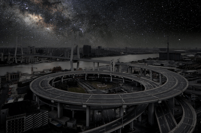
What would New York City, San Francisco, or Shanghai look like with a full sky of brilliant stars? Thierry Cohen, a French photographer, thinks he can show us by blending city scenes — shot and altered to eliminate lights and other pollution— and the night skies from less populated locations that fall on the same latitude on Earth. The result is what city dwellers might envision in the absence of any light pollution.

According to the NYT:

Paris gets the stars of northern Montana, New York those of the Nevada desert. As Cohen, whose work will be exhibited at the Danziger Gallery in New York in March, sees it, the loss of the starry skies, accelerated by worldwide population growth in cities, has created an urbanite who “forgets and no longer understands nature.” He adds, “To show him stars is to help him dream again.”

Below, a sample of these stunning photographs:

Shanghai without smog and light pollution.

Shanghai without smog and light pollution.

San Francisco.

San Francisco.

Starry New York City.

Starry New York City.

Los Angeles without the light pollution.

Los Angeles without the light pollution.

Hong Kong by night.

Hong Kong by night.


See the entire series on Thierry Cohen’s website.

Faking It: Manipulated Photography Before Photoshop

Take a look at the photograph below. Do you think it is real or fake? Or it is simply a matter of perception?

The New York Times considers this photograph, and a few others, in this piece about an exhibition focusing on manipulated photography at the Metropolitan Museum of Art:

A technical problem in the 19th century, for example, was that photographic emulsions were disproportionately sensitive to blue and violet light, resulting almost always in overexposed skies. So like many other landscape photographers, Carlton E. Watkins inserted properly exposed clouds from a different negative into the blank sky in a grand view of cliffs along the Columbia River in Oregon that he shot in 1867. In the exhibition you can compare one print without and one with the interloping clouds. Though artificially produced, the print with clouds looks more natural.

But, you might ask, is tweaking to achieve more realistic effects in the same category as flimflam? At about the same time that Watkins was photographing out West, the journeyman studio photographer William H. Mumler made a name for himself selling “spirit photographs,” in which ghostly visitors appeared in portraits of real people. If you look at his prints now, it is hard to believe that anyone could have been deceived by them, but many were, until the law intervened and charged him with fraud and larceny.

Mia Fineman, the organizer of the exhibition, claims that her goal is to make viewers understand that “a different view of photography prevailed among the intelligentsia for most of the 20th century.” Take a look at this photograph, for example:


Mary Todd Lincoln with the spirit husband, Abraham Lincoln.

Photographed by William Mumler, such a “spirit photograph” fooled many people in its heyday. So ferocious was the case against him that he was taken to court for fraud, with noted showman P. T. Barnum testifying against him. Though found not guilty, his career was over, and he died in poverty.

If you’re in New York, or visiting there in the next couple of months, the exhibition Faking It is something worth checking out.

Color Printing Reaches the Ultimate Resolution

This piece in Nature made my jaw drop:

The highest possible resolution images — about 100,000 dots per inch — have been achieved, and in full-colour, with a printing method that uses tiny pillars a few tens of nanometres tall. The method, described today in Nature Nanotechnology1, could be used to print tiny watermarks or secret messages for security purposes, and to make high-density data-storage discs.

Each pixel in these ultra-resolution images is made up of four nanoscale posts capped with silver and gold nanodisks. By varying the diameters of the structures (which are tens of nanometres) and the spaces between them, it’s possible to control what colour of light they reflect. Researchers at the Agency for Science, Technology and Research (A*STAR) in Singapore used this effect, called structural colour, to come up with a full palette of colours. As a proof of principle, they printed a 50×50-micrometre version of the ‘Lena’ test image, a richly coloured portrait of a woman that is commonly used as a printing standard.

Optical Resolution Image testing with “Lena”. Click to see larger size.

That’s the summary of this paper, whose abstract describes the optical limit of resolution:

The highest possible resolution for printed colour images is determined by the diffraction limit of visible light. To achieve this limit, individual colour elements (or pixels) with a pitch of 250 nm are required, translating into printed images at a resolution of ~100,000 dots per inch (d.p.i.). However, methods for dispensing multiple colourants or fabricating structural colour through plasmonic structures have insufficient resolution and limited scalability. Here, we present a non-colourant method that achieves bright-field colour prints with resolutions up to the optical diffraction limit. Colour information is encoded in the dimensional parameters of metal nanostructures, so that tuning their plasmon resonance determines the colours of the individual pixels. Our colour-mapping strategy produces images with both sharp colour changes and fine tonal variations, is amenable to large-volume colour printing via nanoimprint lithography, and could be useful in making microimages for security, steganography, nanoscale optical filters, and high-density spectrally encoded optical data storage.

Also, I just discovered that you can read PDF papers/articles in ReadCube. Try it for the paper above here.

Instagram Photos in Sports Illustrated Magazine

Brad Mangin shares his story of how Sports Illustrated picked up his Instagram photos and is publishing them in the latest issue of the magazine. The set consists of 18 baseball photos spread over six pages. He describes his process in this blog post:

I shoot all of my pictures with the native camera in my phone. All editing and toning happens within the iPhone, too, using a few of my favorite iPhone apps. Once it looks good, I import the final image into Instagram. The final step in my workflow involves uploading the images to my PhotoShelter archive, which is where editors like Nate can easily view and download them for publication.

Some of my favorite apps include Dynamic LightSnapseed, and Camera+. I really love Snapseed for converting images to black and white and for toning my images. Dynamic Light is my favorite app for making a sky look dramatic and for adding great color to images. Once I get the image into Instagram I usually apply the Lo-fi filter and border if I want high contrast and rich color, or rich black and white. If I want muted colors with an old-school look, or if I want to make a black and white image into sepia-toned I use the Earlybird filter and border.

This is good news for photography and Instagram.